
Templates
A template is a layout. Frontmatter picks one by name, so different posts on the same site can produce different kinds of image from the same config.
| Name | Layout | Props it reads beyond title and subtitle |
|---|---|---|
banner |
Left-aligned title with optional version, subtitle, corner badge and footer. | version, badge |
card |
Minimal centred title with an optional subtitle. | |
code |
Syntax-highlighted snippet on a rounded panel over the background. | code, language, theme |
article |
Tags, headline and standfirst, with a byline along the bottom. | tags, author, date, avatar |
quote |
A pull quote with the speaker under it. | quote, author, role, avatar |
terminal |
A command and its output, in window chrome. | command, output, prompt, title |
release |
A version, what it is, and the headline changes as a list. | version, changes |
stat |
One big figure with a label above and a caption below. | stat |
photo |
The post’s photograph, scrimmed, with the title over the bottom of it. | image |
wordmark |
The configured logo above a name and tagline. | |
docs |
A breadcrumb trail, a rule, then the page’s title. | breadcrumb |
event |
A date on a plate, then what the event is and where. | date, location |
thumbnail |
One title grown to fill the frame, for a video thumbnail. | |
cover |
A mark beside a name and tagline, for a profile header. |
The code template has enough of its own behaviour to need
a page of its own. Every one of the others is described
under The templates one by one below.
All of them draw the configured footer. Most draw the
configured logo too, in the corner the layout leaves free, except that
wordmark puts it in the middle as the subject of the image and code,
terminal and quote draw no logo at all: the first two have a panel where it
would go, and the third is a quotation with nothing else on the image. See
Logos, avatars and photographs for where each one
puts them.
Anything a template reads and the post does not carry is left out, and the rest of the layout takes the room back.
Choosing a template
Section titled “Choosing a template”The template field inside the props block names it:
---meta_img_props: template: card title: About---A post that names no template gets content.defaultTemplate, which is unset by
default. Both the field name and the default are configurable under content;
see Frontmatter.
Naming a template that is not registered fails the build and lists the ones that are, because a name typed into frontmatter is easy to get wrong:
Unknown template "bannner". Available templates: article, banner, card,code, cover, docs, event, photo, quote, release, stat, terminal, thumbnail,wordmark.The badge on a banner
Section titled “The badge on a banner”A badge in config is the same corner badge on every banner image a site
renders, which suits a site whose posts are all of a kind. A post can say
otherwise:
---meta_img_props: template: banner title: Keep test state inside each test case badge: false---false draws no badge on that image, and the title takes back the room that was
being reserved above it. An object replaces the configured badge instead, so a
post can carry one the config knows nothing about:
---meta_img_props: template: banner title: Simulating S3 in a test suite badge: text: video background: "#111827" color: "#f9fafb"---Only text is required, and the colours default to white on the brand colour as
they do in config. A post’s badge wins over a
per-size one as well, since it describes
the post rather than the shape of the image.
A badge that is neither an object with text nor false is
reported and the configured badge is drawn, which
leaves the post with the image it would have had if it had said nothing.
The templates one by one
Section titled “The templates one by one”article
Section titled “article”The usual blog card, with tags along the top, the headline and its standfirst in the middle, and the author and date along the bottom.
---meta_img_props: template: article title: Keep test state inside each test case subtitle: Shared fixtures save a few lines and cost you the ability to read one test on its own tags: [typescript, testing] author: Hugh Grigg date: 30 July 2026 avatar: ./authors/hugh.png---tags may be a list or a single value, and tags that do not fit are dropped
rather than wrapped: the row is a hint at the subject, not the post’s whole tag
list. The avatar is drawn beside the byline rather than beside the footer, so
the two ends of the bottom line say different things: who wrote this post at
the left, whose site it is at the right. Where there is not room for both, the
date goes first and the author’s name is cut only if it has to be.
Nothing here parses the date. Whatever the post wrote is what is drawn, since a build cannot know which locale the site is in or how much precision the post wanted.
A pull quote, with an oversized quotation mark in the accent colour above the words and the speaker below them.
---meta_img_props: template: quote quote: A template is a layout, and a layout is arithmetic you can look at. author: Hugh Grigg role: Kensio Software---title is read where there is no quote, since a post about one sentence
usually has that sentence in its title already. There is no logo on this one:
the quotation is the whole image.
terminal
Section titled “terminal”A command and what it printed, drawn in a terminal window. The same text on a plain panel reads as a snippet, whereas in a window it reads as something somebody ran.
---meta_img_props: template: terminal title: colophon command: colophon build content --force output: | rendered 14 images from 7 posts done in 1.9s---prompt defaults to $, and title goes in the window’s bar rather than
above it. The command is highlighted as shell; the output is not, since a shell
grammar run over arbitrary output colours words for reasons the reader cannot
see.
A command of several lines is several commands, so each one gets its own
prompt, which is what a terminal shows for a run of them. A blank line between
two does not, since a prompt with nothing after it reads as a command that was
never typed.
Underneath it is the code template, so everything under
code applies here too: the monospace family, the line
height, the font-size bounds, and the syntax theme the window takes its
background and foreground from. A session too long to fit is truncated with an
ellipsis and reported, exactly as a snippet is.
release
Section titled “release”A changelog post, with the version as the headline, what the release is below it, and then the headline changes.
---meta_img_props: template: release version: 2.5.0 title: Templates, themes and a browser-safe core changes: - Nine more templates - A manifest of every image a build wrote---A v goes in front of the version unless it already has one, so 2.5.0 and
v2.5.0 both draw v2.5.0. Four changes are drawn and the rest are left to
the post; each is one line, cut with an ellipsis where it is too long.
One figure with a label above and a caption below.
---meta_img_props: template: stat title: Downloads this month stat: 1.4M subtitle: Up from 900k in June---The figure shrinks a long way rather than wrapping, since 42 and
1.4 million downloads are both things people write in that field.
The post’s own photograph, with the title set over the bottom of it.
---meta_img_props: template: photo title: A morning on the Mendips subtitle: Twelve miles, one flask of tea image: ./posts/mendips/hero.jpg---image is a path or a data: URI, loaded the way
avatar is. It comes from the post rather than
from config because config is the same for every post, whereas this template
exists to put a different photograph on each one. A post with no image still
renders, over whatever background is configured.
The wash over the picture is not optional and is heavier than the one a configured background image gets, because here the words sit right on top of it. Text over an unshaded photograph is legible or not depending on what the photograph happens to hold, and a build cannot look at it.
wordmark
Section titled “wordmark”The logo above a name and a tagline, for a homepage or a repository preview, where the thing being shared is the project rather than a post.
---meta_img_props: template: wordmark title: "@kensio/colophon" subtitle: Social meta images from frontmatter---The mark is part of the centred group rather than pinned to a corner, since here it is the subject. The name is always one line, shrunk as far as it takes and then cut, because a scoped package name is one long word and wrapping it breaks it mid-word.
A reference page, with the trail that leads to it above a rule and its title below.
---meta_img_props: template: docs breadcrumb: [Docs, Configuration, Fonts] title: Fonts subtitle: Load font files so a build renders the same image everywhere---Docs pages share badly on their own: “Fonts” says nothing about which project’s.
breadcrumb may be a list or a single string, and a trail too wide for the
image loses its leading segments to an ellipsis rather than its last ones,
which are the ones that say where the page sits.
An image for a talk, a meetup or a workshop.
---meta_img_props: template: event date: 14 November 2026 title: Rendering text without a browser location: Bristol JS, The Old Fire Station---The date is set on a plate in the accent colour rather than as another line of
text, because it is the one thing a reader is scanning for. As with article,
the date is drawn as written.
thumbnail
Section titled “thumbnail”A video thumbnail: one title, set as large as it will go.
---meta_img_props: template: thumbnail title: Rendering text without a browser subtitle: Episode 4---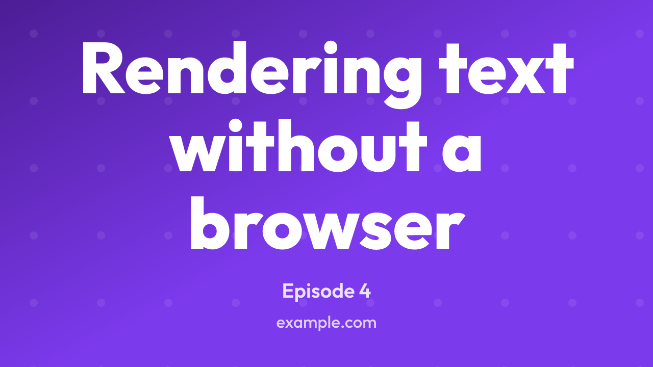
Render it at SIZE_PRESETS.thumbnail, which is the 1280x720 YouTube asks for:
import { defineConfig, SIZE_PRESETS } from "@kensio/colophon";
export default defineConfig({  sizes: [SIZE_PRESETS.og, SIZE_PRESETS.thumbnail],});
What makes this a template rather than a card at other proportions is where
the image is looked at. A share card is seen more or less at the size it was
rendered; a thumbnail is seen in a list, a sidebar or a phone, at something
between a third and a sixth of it. Three things follow from that.
The title is grown to fill the frame rather than set at a fraction of the height, so a three-word title is drawn much larger than a twelve-word one. Every other template does the opposite, and is right to: a heading that swelled to fill its space would stop looking like a heading. Here the words are the picture.
There is one text field. subtitle is available for a series name or an episode
number and is drawn small under the title, taking its room from the title’s, but
the format rewards leaving it out.
The margins are tighter than elsewhere, since the room they give back is the
point. The configured logo and footer are still drawn, and a size can drop the
footer with footer: "" where the title should have the whole frame.
One thing worth knowing about the text: it grows until it hits either the width or the height, and more lines set larger beats one line set small. A long title therefore wraps onto four or five lines rather than shrinking, which is what reads at thumbnail size. A title too long to fit even at the floor, around a tenth of the image height, is cut to the lines there is room for.
Textures want to be coarser here too, for the same reason the text does. See
textureScale.
A profile cover: the configured logo beside a name, with a tagline under it.
---meta_img_props: template: cover title: Kensio Software subtitle: Tools for people who publish on the web---
This is the header image at the top of a profile rather than a card attached to
a post, so it is made once for a site and usually declared in
extra rather than driven by frontmatter:
import { defineConfig, SIZE_PRESETS } from "@kensio/colophon";
export default defineConfig({  extra: [    {      props: {        template: "cover",        title: "Kensio Software",        subtitle: "Tools for people who publish on the web",      },      output: "public/covers/x.png",      size: SIZE_PRESETS.xCover,    },  ],});
There is a preset per platform, each carrying the safe area that platform’s crop and avatar leave behind. Cover images has the sizes, the safe areas and where the numbers came from.
What makes this a template rather than the wordmark at other proportions is
the shape of the space. A cover is a strip somewhere between 2.6:1 and 6:1, and
a layout that stacks a mark above a name has nothing left to set the name in. So
the mark goes beside the words, and the pair is centred as one lockup. A site
with no logo configured gets the words alone, centred the same way.
The name is one line, shrunk to fit and cut with an ellipsis if it still will
not, for the reason the wordmark’s is: a name broken across two lines stops
reading as a name, and on a strip there is no second line to break onto anyway.
The tagline may wrap to two.
Tracking the tagline to the name
Section titled “Tracking the tagline to the name”tracking: fill spaces the tagline’s characters out until it is exactly as wide
as the name above it, so the pair share both edges and read as one block:
---meta_img_props: template: cover title: Kensio Software subtitle: kensiosoftware.co.uk tracking: fill---This is the adjustment somebody makes by hand in a drawing program and then has to make again every time the words change. A site URL under a product name is what it is for.
It is opt-in, and it declines rather than doing something silly in three cases. A tagline already as wide as the name is left alone, because the only way to close the gap would be to pull the letters together, and letters pushed apart read as a decision where letters pulled together read as a mistake. A tagline that wrapped to two lines is left alone, since justifying every line to the same width goes wrong on the short last one the way justified text always does. And a tagline needing more than half an em between its characters is left alone, which is the point past which a two-word strapline under a long name stops looking considered.
trackingFor and trackedWidth are exported from
@kensio/colophon/layout, so a template of your own can do the
same thing. TextLine carries the result as letterSpacing.
The other thing it does differently is size its text from the room it has rather than from the image. Everywhere else those are nearly the same number; on a YouTube banner they are 423 and 1440, so a title set at a tenth of the image would be a third of the height of the part anyone sees.
Writing your own
Section titled “Writing your own”Pass templates in config. The keys are the names frontmatter uses, and what
you supply is merged over the built-ins, so a key of banner replaces the
built-in banner.
A template’s render receives the props, the resolved config, the pixel
dimensions of the image being drawn, a measure for its text, and the logo
and avatar for the image, already loaded. It returns
the SVG foreground content. The background and the enclosing <svg> root are
added by the renderer, so a template does not draw them.
import { defineConfig, type Template } from "@kensio/colophon";import { box, drawLines, blockLines, inset } from "@kensio/colophon/layout";
const stripe: Template = {  name: "stripe",  render({ props, config, dimensions, measure }) {    const full = { x: 0, y: 0, ...dimensions };    const content = inset(full, Math.round(dimensions.width * 0.07));
    const lines = blockLines(props.title, measure, config.fontFamily, {      maxWidth: content.width,      maxLines: 2,      fontSize: Math.round(dimensions.height * 0.1),      floor: 0.65,      fontWeight: 700,      opacity: 1,    });
    return (      box(        {          x: 0,          y: dimensions.height - 32,          width: dimensions.width,          height: 32,        },        { fill: config.colors.brandWarm },      ) +      drawLines(lines, content, {        fontFamily: config.fontFamily,        fill: config.colors.foreground,      })    );  },};
export default defineConfig({  colors: { brand: "#2563eb" },  templates: { stripe },});
Those primitives are the layout toolkit, which is what the
built-in templates are written on. Returning a string you built yourself works
just as well, and escapeXml is exported for when you do.
Some notes on writing one:
- Size everything from
dimensions. The same template is asked to draw a 1200x1200 square and a 1200x630 landscape. Fractions of the width travel better than fixed pixel values, since that is what a feed scales the image to. - Escape anything that came from frontmatter. The toolkit does it for you;
escapeXmlis exported for the SVG you write by hand. A title containing&produces an invalid document otherwise. propsis open. Colophon does not check what a template reads, so you can put whatever fields your layout needs into the props block.- Images arrive loaded.
logoandavatarareundefinedor an asset with ahrefto hand toimageand theaspectto size it by. Reading files is the renderer’s job, which is what keepsrendera function over values. See Logos and photographs. rendermay return a promise if it has to load something. Keep it synchronous when it does not need to. The built-incodetemplate is async because it loads syntax grammars on demand.- Measure text rather than guessing at it.
measure(text, style)gives the width in pixels that a run of text will occupy, read from the font the build is rendering with. Widths are exact where the family resolves to a font supplied underfontsand estimated otherwise, so a template never has to handle the two cases itself. Counting characters is not a substitute, even for a monospace layout: an ideograph is a full em where a Latin letter is a little over half of one, so the same count is two different widths.blockLinesandfitTextdo the usual jobs of breaking a title across lines and shrinking one that does not fit; see the layout toolkit.
config here is the resolved config, with defaults applied and per-size
overrides folded in, so config.colors.brandWarm is always a colour and
config.footer is either a string or undefined.