
Themes and background treatments
A theme is a named look, made up of a palette, a background and a texture over it. Naming one is the shortest config a project can write.
export default defineConfig({ theme: "midnight", footer: "example.com",});The set
Section titled “The set”| Theme | Look |
|---|---|
midnight |
Deep navy, indigo and violet mesh, faint dot grid |
aurora |
Near-black teal under teal and violet, faint crosses |
ember |
Warm dark, brown into orange, rays from below |
forest |
Deep green, ruled diagonally |
bloom |
Violet into pink and magenta, faint dot grid |
slate |
Flat cool navy with a dot grid |
paper |
Warm off-white, ruled, near-black text |
sandstone |
Pale sand gradient with a dot grid, near-black text |
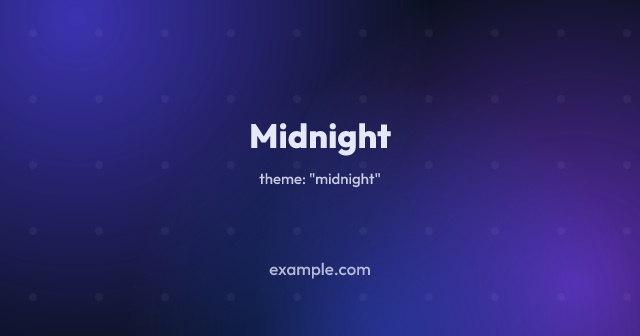 |
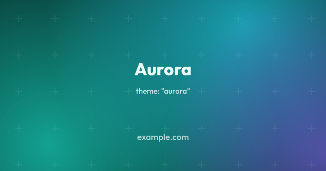 |
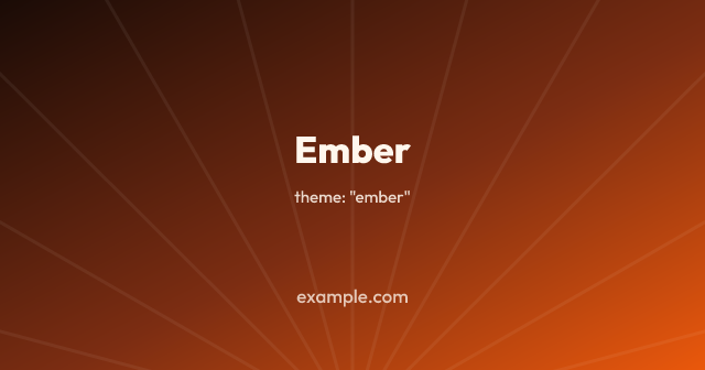 |
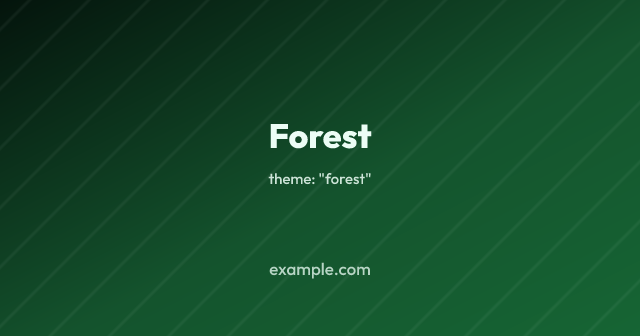 |
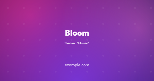 |
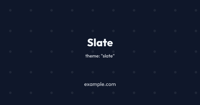 |
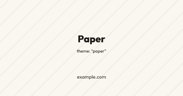 |
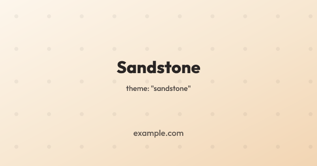 |
Six are dark, because white text on a deep background is what a share image is usually asked to be, and two are light for a site whose own pages are.
What a theme sets
Section titled “What a theme sets”colors, background and texture, and nothing else. Those are
ordinary config options, so a theme is a set of defaults rather than a fixed
look, and any of the three you name yourself is the one that is used.
export default defineConfig({ theme: "midnight", // Keeps midnight's mesh and dot grid; the badge and text follow this brand. colors: { brand: "#0d9488" },});The consequence worth knowing is the one in that comment. A theme’s background
is written out rather than derived from its palette, so changing colors
changes the accent and the text and leaves the picture behind them alone. That
is deliberate: midnight without its mesh and slate without its dot grid are
the same flat navy image, so a theme that was only a palette would have very
little to it. Set background as well when you want the whole thing to follow
your own colours, or use colors on its own without a theme, which derives the
usual gradient from your brand.
An unknown theme name stops the build rather than being ignored, along with every other unrecognised value.
Textures
Section titled “Textures”The treatments can be used on their own, over any background:
export default defineConfig({ colors: { brand: "#2563eb" }, texture: { type: "dots" },});A texture is drawn over the background and under everything the template draws, so it never comes between a headline and the reader. All of them are intended to be noticed only in passing, and the defaults are faint.
| Texture | Options |
|---|---|
"dots" |
color, opacity, size, gap |
"rules" |
color, opacity, width, gap, angle, cross |
"waves" |
color, opacity, width, gap |
"rays" |
color, opacity, width, count, x, y |
"moire" |
color, opacity, width, gap, angle |
"grid" |
color, opacity, width, gap, major |
"crosses" |
color, opacity, size, width, gap |
"chevrons" |
color, opacity, width, gap |
"honeycomb" |
color, opacity, width, size |
"scallops" |
color, opacity, width, size |
"halftone" |
color, opacity, size, gap, angle, from |
"topographic" |
color, opacity, width, gap, relief, seed |
Every texture defaults to the foreground colour, so it shows up on a light theme as readily as on a dark one. Lengths are in pixels at the size being rendered.
They are not fine lengths. A share image is looked at somewhere between a third
and a sixth of the size it was rendered at, so a treatment pitched to look
right on the full-size picture is not there at all in the feed the picture is
for. The defaults carry through that, and a project wanting the finer version
of one lowers gap or size itself.
Textures at thumbnail size
Section titled “Textures at thumbnail size”Pixels at the size being rendered is the right unit as long as the image is looked at somewhere near that size. A YouTube thumbnail is not: it is uploaded at 1280 wide and shown in a list at a third of that or less, so a dot grid at its default 66px spacing arrives at the reader about 15px apart. That is not a texture any more, it is a slightly dirty background.
textureScale multiplies every length in the treatment, so the picture is the
one it always was and simply larger:
export default defineConfig({ texture: { type: "dots" }, textureScale: 2,});It usually belongs on a size rather than on the whole
build, because what it corrects for is where the image ends up rather than
anything about the treatment: the same dot grid wants its default spacing on an
Open Graph card and twice that on a thumbnail.
SIZE_PRESETS.thumbnail therefore carries textureScale: 2 already, and it is
the only preset that carries an override of its own.
sizes: [ SIZE_PRESETS.og, // drawn at the stated lengths SIZE_PRESETS.thumbnail, // twice as coarse { ...SIZE_PRESETS.thumbnail, textureScale: 3 }, // or your own figure],Below 1 it draws a finer treatment than the numbers say, which is the same
lever the other way. It costs no more to render and very little to store, since
what is on the image is the same picture at a different size.
waves is two sets of concentric rings, one centred on the middle of each side
edge:
export default defineConfig({ colors: { brand: "#16a34a" }, texture: { type: "waves" },});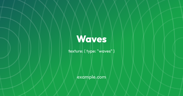
What you see is not the rings but the interference between the two sets, which reads as curves flowing across the image. Unlike the dot grid and the ruled lines it is not a tile, so it does not repeat, and its shape follows the proportions of the image: a landscape gets flatter curves than a square.
opacity is the set drawn from the left, and the set from the right is drawn
fainter than that. gap is the distance from one ring to the next, and it is
the setting worth playing with, since it decides how tight the curves are.
Above about 40 the two sets stop blurring into each other and the image reads
as what it is, which is a lot of circles.
Waves costs bytes as well
Section titled “Waves costs bytes as well”There are only a few dozen circles to draw, but their antialiased edges put a different set of colours in every row of the image, which is most of what PNG compresses by. Measured on one 1200×1200 card over a gradient, in a single run so that the rows are comparable:
| Texture | PNG |
|---|---|
| none | 36KB |
crosses |
42KB |
dots |
43KB |
halftone |
50KB |
chevrons |
57KB |
grid, major 0 |
57KB |
grid |
64KB |
rays |
78KB |
rules |
83KB |
honeycomb |
85KB |
scallops |
92KB |
topographic |
112KB |
rules, cross |
182KB |
waves, gap 66 |
228KB |
moire |
324KB |
waves |
349KB |
Rendering is around 330ms against 170ms with no texture. If the size matters
more than the format does, format: "webp" takes the same
image to a fraction of that, since a lossy encoding does not care how many
colours a row holds.
Coarser lengths cost nothing here, and the two dearest treatments they save on:
a wider stroke puts back roughly what the wider spacing takes away, so dots
and grid are unchanged to the kilobyte, while waves came down from 450KB
and moire from 385KB.
rays is straight lines fanning out from one point, which by default sits just
below the bottom edge of the image:
export default defineConfig({ colors: { brand: "#4f46e5" }, texture: { type: "rays" },});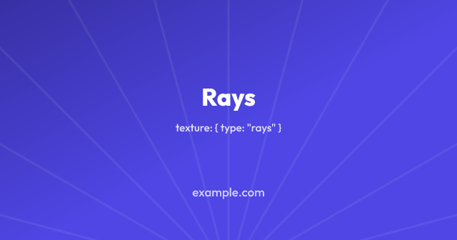
x and y move the origin, as fractions of the image, so { x: 0, y: 0 } is
the top-left corner and { y: 0.5 } is a star in the middle rather than a fan
across the picture. count is rays around the whole circle, of which only
those pointing into the image are seen, so the spacing stays the same wherever
the origin goes.
Of the treatments that cover the whole image rather than repeating a tile, this
is the cheap one: there are no curves in it and only a few dozen lines, so a
1200×1200 image goes from 82KB to 164KB. That is nearer the dot grid than
waves.
Chevrons and honeycomb
Section titled “Chevrons and honeycomb”chevrons is rows of V shapes, and honeycomb is hexagon outlines:
export default defineConfig({ colors: { brand: "#16a34a" }, texture: { type: "honeycomb" },});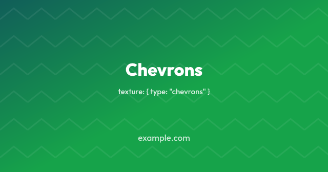
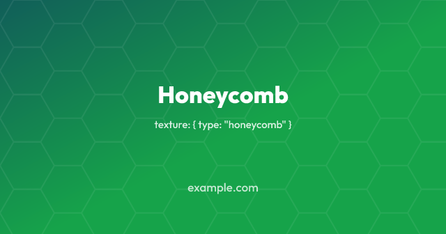
chevrons takes gap, which is both how wide one chevron is and how far
apart the rows are. honeycomb takes size, the length of one side of a
hexagon, and its repeat is the only one here that is not square: a honeycomb
fits in a rectangle three sides across and size × √3 down.
Both are tiles, and both cost more than the dot grid without being anywhere
near waves. What they have that dots and squared paper do not is diagonal
edges, and a diagonal is antialiased differently in every row it passes
through.
Halftone
Section titled “Halftone”halftone is a grid of dots that grow across the image, which is a gradient
made out of print:
export default defineConfig({ colors: { brand: "#16a34a" }, texture: { type: "halftone" },});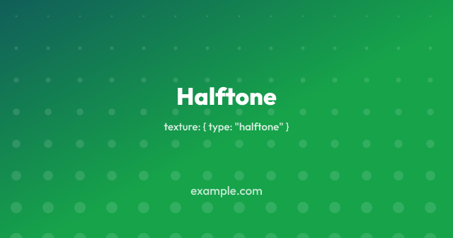
angle is the direction they grow in, where 0 runs to the right and 90,
the default, runs down the image. from is how big the smallest dot is as a
fraction of the largest, so raising it flattens the ramp.
It cannot be a tile, since every dot is a different size, and it is still one of the cheaper treatments: the size follows the position rather than chance, so a run of dots across the image is a smooth ramp with nothing noisy in it.
Scallops and topographic
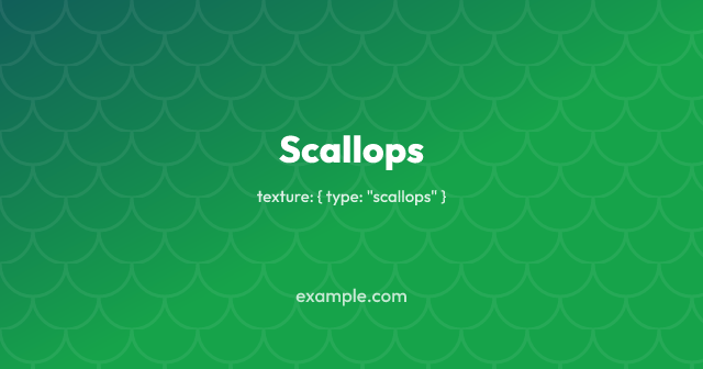
Section titled “Scallops and topographic”scallops is rows of arcs, each offset by half a scale from the row above.
topographic is contour lines, the height of a made-up landscape drawn every
gap pixels of it.
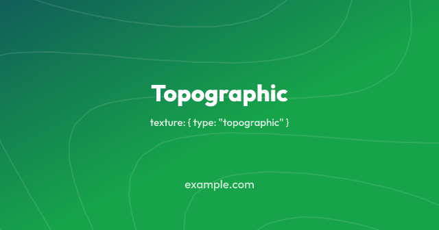
The contours are the real thing rather than circles pretending: the ground is
sampled on a grid and each line traces one height through it, so the shapes
close around a summit, run off the edge where the ground keeps rising, and
never cross. relief is how tall the landscape is, counted in contours between
a valley and a summit, and seed picks which landscape: it moves the phases
and nothing else, so the same seed always draws the same map.
Nothing here rolls dice, which matters more than it sounds: rebuilds assume that one config draws one picture, so a texture that was random would come out different every time nothing had changed.
Crosshatch
Section titled “Crosshatch”rules takes a cross flag, which draws a second set at the opposite angle:
export default defineConfig({ colors: { brand: "#7c3aed" }, texture: { type: "rules", cross: true },});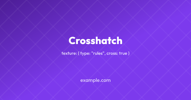
The crossing set is drawn fainter than the first, which is what makes the two read as a weave rather than as two sets of lines.
It is not the cheap change it looks like. One set of rules costs 94KB on the 1200×1200 card and two crossing sets cost 294KB, because the crossings put tones in the image that neither set has on its own, and they land in a different place in every row. A tile keeps the SVG small; it is the picture that has to repeat for the file to stay small, and here it does not.
Grids and crosses
Section titled “Grids and crosses”grid is squared paper: lines both ways, with a heavier one every so often.
crosses is a small cross where each of those lines would meet, which is the
dot grid with a little more to look at.
export default defineConfig({ colors: { brand: "#0369a1" }, texture: { type: "grid" },});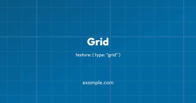
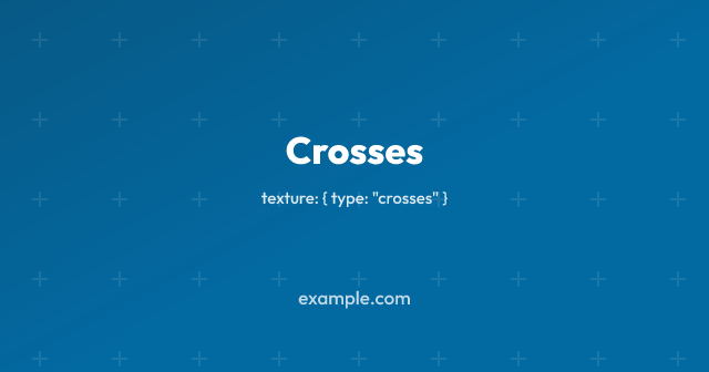
major is how many squares apart the heavier lines are, drawn at twice the
width. Set major: 0 for a plain grid with none.
Both are tiles square to the image, so both are among the cheap ones. Crosses cost about what the dot grid costs. The grid costs a little more, since a row of the image crosses a great many more lines than it does dots, and the heavier lines add a second pass over it.
moire is two square grids, one turned a few degrees against the other:
export default defineConfig({ colors: { brand: "#0f766e" }, texture: { type: "moire" },});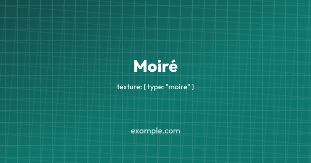
What is seen is the interference between them rather than either grid: the lines cross at a different offset in every part of the image, which reads as broad bands sweeping across it.
angle is the whole texture. Below about one degree the bands are wider than
the image, and it looks like one grid slightly out of true; above about ten
they tighten into a weave. gap is the second lever, and the one that decides
what the image costs.
It is nearly as expensive as waves, at around 320KB for a 1200×1200 image,
which is worth knowing because the reason is not obvious. Being drawn from a
tile makes the SVG small, but the tile is what repeats, not the picture: a
turned grid crosses the lines at a different place in every row, so there is
nothing for the compression to fold up. Raising gap is what brings it down.
Meshes
Section titled “Meshes”A mesh is soft blobs of colour over a flat base, which gives colour that moves in more than one direction, unlike a linear gradient. Each blob is a radial fade, so it costs no more to render than a gradient does.
export default defineConfig({ background: { type: "mesh", color: "#0b1020", blobs: [ { color: "#4338ca", x: 0.12, y: 0.05, radius: 0.55, opacity: 0.85 }, { color: "#7c3aed", x: 0.9, y: 0.85, radius: 0.5, opacity: 0.7 }, ], },});Positions are fractions of the image and radii are fractions of its longer
side, so one mesh describes the same picture at every output size. Blobs are
drawn in order, the later ones over the earlier, and each fades to nothing at
its radius. Keep them off the base colour if you want it to show: a blob at
full opacity with a radius near 1 covers everything.
Per size
Section titled “Per size”A size can name its own theme and texture, which is how a square gets a different treatment from a landscape:
sizes: [ { name: "og", width: 1200, height: 630 }, { name: "square", width: 1200, height: 1200, theme: "paper" },],A size’s theme applies the same way the config’s does, as defaults under
anything named outright. So a config with its own texture keeps it whatever
theme a size asks for.